01 · The brief
Look beyond the checkout.
I worked with Joyce Fung, Kaitlin Gaerlan, and Uditi Shah on a usability assessment of Flair Airlines’ desktop website. We combined observed task performance with interviews to understand both completion and the experience behind it.
Our focus was the wider decision-making journey: finding a fare, understanding what to bring, checking extra costs, and locating information about insurance and cancellation.
02 · The study
Five tasks, followed by a conversation.
The protocol included a background questionnaire, consent, a 30-minute usability session, and a post-session interview. Six people participated; five had not used the site before.
- 6
- participants
- 5
- travel tasks
- 30 min
- usability session
- Find the cheapest Toronto–Las Vegas flights for two adults.
- Find travel-document requirements.
- Check the first checked bag’s price and dimensions.
- Find travel-insurance information.
- Find cancellation and refund information.
Affinity mapping brought observations together around language, visual elements, navigation, and information. This helped us connect task outcomes to the reasons participants struggled.
03 · Key findings
A high completion rate can hide a critical gap.
Most tasks were completed successfully, but the insurance task exposed a substantial problem in this small study.
| Task | Completed |
|---|---|
| Book a flight | 6 / 6 |
| Find travel documents | 5 / 6 |
| Find checked-bag information | 6 / 6 |
| Find insurance information | 1 / 6 |
| Find cancellation and refund policy | 6 / 6 |
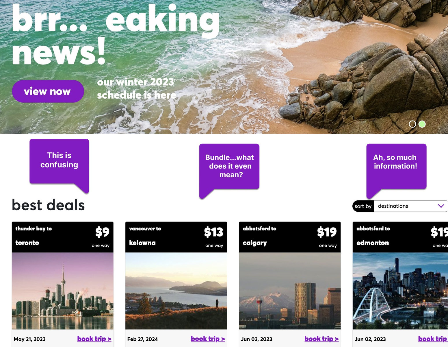
Participants recognized familiar travel-site patterns. At the same time, a broken insurance link, unfamiliar labels, and dense information made it harder to understand their options. Price changes and the presentation of seat choices also affected confidence.
04 · Recommendations
Make the important answers easier to find.
- Repair the broken insurance route so a key decision does not end at an error page.
- Use familiar labels for insurance and travel packages, and offer a search route.
- Make costs and choices clearer by explaining fees and making free seating options visible.
- Reduce the reading burden with a clearer hierarchy, concise sections, and information shown when relevant.
The output was a research presentation with findings and recommendations. The study assessed the website as it existed in 2023; implementation was outside the project’s scope.
05 · What it showed
Measure confidence alongside completion.
Watching whether someone succeeds is only part of a usability assessment. Their questions, expectations, and level of confidence explain where a technically completable journey still needs work.
Combining task data and qualitative analysis made the recommendations more specific than a visual critique alone.